16 July 2008
Tone is Subtle

Labels:
colour,
graphic design. art,
graphics,
green,
tone,
visual art
05 July 2008
Cool Pool

Try taking photos of water with the sun shining on it for a cool and light visual experience. If you focus on the surface of the water you will get a beautiful abstract play of form and colour as well as the feeling of coolness!
Labels:
blue,
graphic design,
graphics,
photgraphy,
pool,
water
27 May 2008
Colour - Don't Be Afraid

Use colour freely and find what works and what doesn't. Some colour relationships have enormous impact on a viewers mood. Work it!
Labels:
color,
colour,
design,
graphic art,
graphic design,
graphicart,
graphicdesign,
graphics,
pink,
visualart
16 April 2008
Flourishing Fonts

For a beautiful effect with text you can use a font with flourishes and swirls to create more interesting type in your designs. Mix up the fonts and exaggerate the first letter as in this example.
Labels:
autumn,
design,
graphic art,
graphic design,
graphicart,
graphicdesign,
graphics,
pink,
text,
type,
typography,
visualart,
words
06 April 2008
Subtle Tone Evokes Pleasure

Tones, or variations on hue/colour, can make pleasing design statements. With experimentation, many things become possible. Shapes, text, floral and other decorative objects can be built in layers to create beautiful effects.
Labels:
decorative,
design,
floral,
graphic art,
graphic design,
graphicart,
graphicdesign,
graphics,
mauve,
space,
tone,
visualart
28 March 2008
Emptiness

Empty space is an ally of graphic design. A lot of information can be conveyed through the use of space and placement of text or objects in strategic places within the space. This example is a powerful method for drawing attention to the text message.
Labels:
contrast,
design,
emptiness,
graphic art,
graphic design,
graphicart,
graphicdesign,
graphics,
magenta,
space,
text,
type,
typography,
visualart,
words
21 March 2008
The Edge

Usually, images are placed within the frame, but by placing images against the edge of the frame you can create powerful graphic design images. Try using different types of image for various effects.
Labels:
design,
edge,
frame,
graphic art,
graphic design,
graphicart,
graphicdesign,
graphics,
photography,
visualart
12 March 2008
Over Under Sideways Downlighting

Downlighting is not normally very attractive on models. But in this case the model is looking in a mirror and the downlight has no affect on the features of the model except to provide general lighting. Try using mirrors and light from different angles to create dramatic effects in your graphic design photography.
Labels:
design,
graphic art,
graphic design,
graphicart,
graphicdesign,
graphics,
lighting,
mirror,
photography,
visualart
05 March 2008
Less Than %100 Black

When placing dark, or black, text on a light background, if you chose about 80% of the full colour, you get a softer, lower contrast. It can make a big difference to how your readers engage with your design.
Labels:
contrast,
design,
graphic art,
graphic design,
graphicart,
graphicdesign,
graphics,
text,
type,
typography,
visualart,
words,
yellow
19 February 2008
Dynamic Organisation

Visual dynamics and tension is easy to create using space and placement of objects. You can try an infinite number of positions in your graphic design to create powerful dynamic images easily.
Labels:
color,
colour,
complimentary colours,
design,
graphic art,
graphic design,
graphicart,
graphicdesign,
graphics,
pattern,
visualart,
yellow
09 February 2008
Making Patterns & Wallpaper

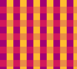
You can create complex visual effects with simple techniques. This one uses only two colours. It can be used as a background, or as the basis for a repeating pattern or wallpaper for your design work on the web or on a greeting card.
Labels:
backgrounds,
cerise,
color,
colour,
complimentary colours,
design,
graphic art,
graphic design,
graphicart,
graphicdesign,
graphics,
pattern,
purple,
visualart,
yellow
06 February 2008
Text as Shape

Text can be used to create shapes. This makes it easier to use text as a design element, not just for information.
Labels:
design,
graphic art,
graphic design,
graphicart,
graphicdesign,
graphics,
list,
text,
type,
typography,
visualart,
words
29 January 2008
Webdings Quick Fix

Webdings is a font that is installed on just about every computer. If you want some quick graphical images, Webdings has quite a few. You can increase the variations by holding down the shift key and even more by holding down the option/alt key.
25 January 2008
Depth of Field
Labels:
color,
colour,
depth of field,
design,
fruit,
graphic art,
graphicdesign,
graphics,
photography,
plums,
visualart
20 January 2008
Complimentary Colours

Complimentary colours on a standard color wheel they are the colors opposite each other (red/green, yellow/blue). They look great together and compliment each other. They make people feel good when looking at them.
Labels:
colors,
complimentary colours,
design,
graphic art,
graphic design,
graphicart,
graphicdesign,
graphics,
purple,
visualart,
yellow
05 January 2008
Serif or Sans Serif?

A serif is slight projection finishing off a stroke of a letter. Sans serif means without that stroke. When you chose text for your designs you choose between serif fonts and sans serif fonts. They both have their place and can have a big effect on how your message is read.
Labels:
design,
graphic art,
graphic design,
graphicart,
graphicdesign,
graphics,
sans serif,
serif,
text,
type,
typography,
visualart,
words,
yellow
Subscribe to:
Posts (Atom)

