Contrast can be an affective design tool. It can create a lot of interest in your designs and also add dramatic effects. In this example their are two types of contrast: shape and texture.
A drop shadow is a visual effect consisting of drawing what looks like the shadow of an object, giving the impression that the object is raised above the objects behind it.
Light is the essence of photography. Look carefully at how light falls on objects at different times of day. If you take advantage of natural light you can produce beautiful photographs that can be incorporated into your beautiful graphic designs.
Grey/Gray can be a useful backdrop for a splash of colour/color. Its a great technique for creating dramatic effects and bringing a key element into focus.
Here are two types of column. The one on the left is aligned left, producing a ragged right edge. The one on the right is aligned justified. See the difference it makes to the look and feel of text.
Repetition is an easy way of making backgrounds and patterns for decorative panels on cards and invitations. You can take photographs of patterns or make them in an image handling program such as GIMP which is free at www.gimp.org
You can use type to make your design look beautiful. Just make the type size really big and choose a font that has flourishes or other decorative elements. This example is the edge of an upper case letter D.
Using variations on opacity can help you make beautiful images that look translucent on the web. For example, this image would make a great background for an email newsletter.
Texture can be text or pattern. You can develop a library of textures by taking photos of surfaces such as pebbles, leaves and fabrics. Texture can be used for creating backgrounds in documents or web pages.
Get up close to see the beauty in all things. If you take pics with the highest possible resolution on your camera you can create a myriad of opportunities with just one image by cropping and resizing different aspects of the photo. This technique is easy and enables you to make strong and beautiful images for your graphic designs whether they are intended for newsletters or cards or websites.
Photographs do not have to be in focus to be captivating. You can take out of focus pics or blur images to create mood and movement. Don't be afraid to experiment. Try things that are out of the ordinary and you will discover the beauty in all things, including your own mind.
Its easy to be creative and make your own personal cards for giving. Three simple elements are required to make a beautiful card like this one: a background image, a repeat image for the lower border and some beautiful text. You can play around with these three elements to make your own beautiful cards for giving at Christmas or birthdays, or just wanting to give something beautiful to others.
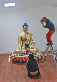
The rule of thirds makes it easy to place figures and other important objects in a photograph. Mentally divide the frame into thirds vertically and horizontally. Place key elements in the third sections for impact and interest. This will improve your photography enormously and get people to take notice of the way you see the world. This photo uses the third on the left and the third on lower portion of the frame. The fact that there is almost nothing in the rest of the pic adds to the interest.
The colour orange is a luscious visual experience on the web. Warm, sweet and evocative, the colour orange is desirable. At Infinity Design we made this web flyer for a workshop where karma, cause and effect, is explained so that participants can understand what actions cause problems and what actions cause desirable effects.
Gradients are an effective way of creating simple and attractive backgrounds for web or print. Float text or images over a colour gradient to create the illusion of depth. You can create colour gradients in most image editing programs. We created this one in Adobe InDesign.
· Infinity Design · We are a discreet graphic design studio in Melbourne, Australia
Infinity Design specialises in beautiful original images created using photographic and other digital methods such as Adobe Photoshop and scans
Our approach to beautiful graphic design is simple - we use beautiful colour and beautiful typography
This blog is aimed at the thousands of people who want to make beautiful images but don't know where to start or how to express their ideas graphically
We intend to post weekly, providing easy tips and suggestions for anyone who wishes to create their own beautiful graphic designs and images